How data integration and visualisation can help deliver better health outcomes and patient care
Health analytics
Welcome to this blog series from the LCP Health Analytics data integration and visualisation team. In this introductory blog, we share a brief history of data being used to benefit human health, what data integration and visualisation is, and why these skills have never been more critical.
Over coming months we’ll bring you more topics in this area, including how better data integration and visualisation can help improve health outcomes, what AI and ChatGPT might mean for healthcare, and an exploration of which industries have gold standard data integration and visualisation which the health sector can learn from.
A brief history: using data to save lives
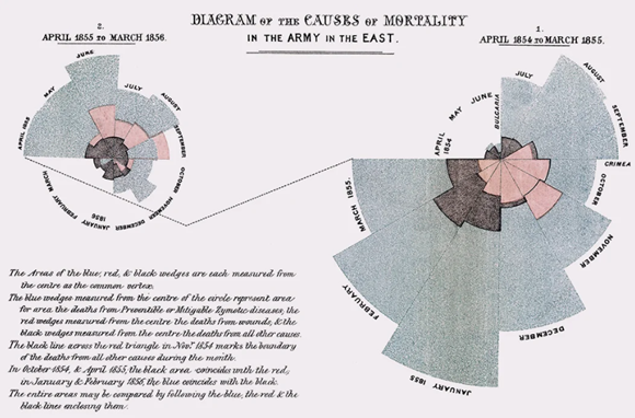
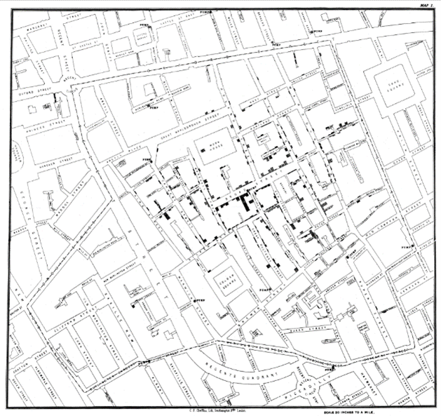
Although the healthcare data revolution has gathered pace only in recent decades, the benefits of how data can be visualised to save and improve lives has been apparent since the 19th century. In 1849 John Snow published his thesis on the transmission of cholera, visualising how cholera infections were concentrated around an infected water source in central London. The contaminated pump was eventually shut off due to Snow’s evidence and cholera infections were greatly reduced. Florence Nightingale’s “Diagram of the Causes of Mortality in the Army in the East” was used to demonstrate that monthly death rates of soldiers in the Crimean war were much higher prior to the introduction of sanitary interventions to improve camp and hospital hygiene. These early examples show the power of using data visualisation to tell a story and ultimately change behaviour.
One industrial, one medical and one cyber revolution later, the need to integrate data sources and visualise them in an understandable manner to improve lives remains critical, just as Snow and Nightingale recognised in the 1800s.
Figure 1: Florence Nightingale and William Farr’s “Diagram of the causes of mortality in the army in the East" (1858) showing causes of death in the British Army. Source: Wikimedia Commons

Figure 2: John Snow’s map from "On the mode of communication of cholera" showing mortality cases concentrated around a contaminated water pump on Broad Street, London. Source: Wikimedia Commons


Distilling wisdom from data
Fast forward to 2023 and data is everywhere. Estimates forecast that the total annual data generation will approach 100 zettabytes for the first time in 2023. Put into context, every one of the 7.9 billion people on Earth would need 100 smartphones each to store this amount of data produced in 2023 alone. But the bigger question is not how much data is being produced, but what are we doing with the proliferation of data and how is this impacting lives.
Data is increasingly being used to make decisions to shape the world in which we live. It is nowhere more relevant than in healthcare. The healthcare ecosystem collects huge amounts of data through established routes, such as clinical trials to test new medicines or pharmacovigilance studies for post-marketing safety studies. Other increasingly important sources are real-world evidence, which includes personal data collected from electronic health records, health wearables, and mobile health applications.
Distilling wisdom from data is not an easy process – the skills needed to do so span data engineering, web development, knowledge of datasets and healthcare systems, and an array of different coding and statistical platforms. Whilst the mountains of data being produced underline potential, it is crucial to translate raw data into information, knowledge and eventually, wisdom. Thus skills in data integration and visualisation have never been more important.
What is data integration and visualisation?
Data visualisation aims to put actionable insights into the hands of decision makers in an accessible and relevant way. Whilst there are many different definitions of both data integration and visualisation, there are key common principles. Data integration is a step taken prior to data visualisation and aims to combine multiple data sources into a single data source. In order to do this, there may be significant amounts of data cleaning steps to be done to ensure the different sources can be merged. The UK’s NHS is a clear case study for where data integration skills are a real necessity. Whilst the NHS certainly has a rich data landscape, with health data collected from cradle to grave, the data that is published is highly fragmented and making sense of it can be difficult. This matters as the insight that can be gleaned from data can help to deliver better care and outcomes for patients.
Data visualisation aims to represent data and information in a graphical way using figures such as time trends, heat maps, pie charts, scatter plots and much more. Doing so is critical to ensure that complex data can be made more understandable and accessible across an array of stakeholders, especially where individuals may not already have expertise in the given area.
Whilst the NHS provides an example of where the potential for impact of good quality data visualisation is high, it’s not yet fully realised. We have been involved with bringing NHS Elective Care waiting list data to life with our work on the LCP NHS Waiting List Tracker. The project has turned seemingly endless spreadsheets of data into accessible heat maps where clinical and geographical inequalities can be seen and understood within a couple of clicks.
What’s next for data visualisation?
There are many other use cases within the NHS where data visualisation could be highly impactful for improving patient care. With the advent of Chat GPT, we now have even more advance tools at our fingertips to bring health data to life. We hope that this blog series will shine a light on the art of the possible for distilling wisdom from data in this space.

